Welcome to Visual Information Design
Every single day, we are flooded with a massive wave of raw, unorganized data, instructions, and messages. On its own, this unstructured flow of chaos remains confusing and not useful. Information design solves these real-world communication problems by taking cluttered data and translating it into clear, highly accessible visual structures and meaningful information. Rather than focusing on pure artistry, this interdisciplinary field acts as a functional bridge between professional writing and visual design. By taking a deliberate approach, designers ensure that content is engineered specifically to reach a target audience and achieve an intended purpose.
Introduction to the Field
Definition of Information Design
Information design is the intentional organization and presentation of data to make it easy for users to read, understand, and use. It strips away unnecessary visual noise or embellishments to focus entirely on efficiency, logic, and clarity. This precise methodology refines disorganization into valuable, structured communication that users can instantly comprehend.
The Intersection of Writing and Visual Layout
True information design cannot exist with just words or pictures because these two disciplines cannot work in isolation. It relies on a careful balance of clear and concise language paired with structured visuals like charts, diagrams, and strategic layouts to tell a complete story. Writing builds the logical skeleton of the message, while visual design guides the reader’s eye.
Core Philosophy
Making Complex Data Accessible
The primary goal of an information designer is to reduce cognitive friction. Whether a user is reading a medical chart, a financial report, or navigating an interface, the design ensures the most important facts stand out and information access is intuitive. Plain, direct language speeds up overall comprehension, while the intentional composition caters to the user's needs.
User-Centered Communication
Great design always puts the reader first to deliver highly usable, user-centric information. By analyzing exactly who the audience is, how they read, their core objectives, and where they interact with a document, designers create tailored layouts that perfectly match real-world needs. Aligning the final presentation format to these specific audience traits ensures the document achieves complete functional success.
The Digital Synergy: UI vs. UX
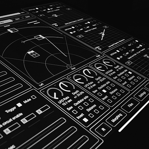
This core synergy is perfectly mirrored in the digital world through User Experience (UX) and User Interface (UI) design. These two concepts function together to make screen-based interfaces and digital documentation intuitive and accessible.

UI (User Interface)
UI represents the visual design execution of a digital layout or document. It dictates the color palette, typography choices, and interactive components that make data presentable on a screen. Good interface design uses these aesthetic elements to create balanced layouts, high figure-ground contrast, and an effective visual hierarchy.
UX (User Experience)
UX represents the structural design execution of a digital document or layout. It maps out the reader's cognitive journey to ensure content remains friction-free, intuitive, and accessible. By focusing on how easily a person can navigate the content, this discipline prevents user errors and reduces reading fatigue.
A beautiful UI loses its meaning if the UX is broken. Successful information design occurs when a flawless UI and a thoughtful UX align to make complex data effortlessly valuable to the end user.